Parameter Exploration
Parameter Exploration, the simplest type of experiment in HoloBit, provides a straightforward interface for conducting single-run simulations on existing models.
Overview
Parameter Exploration allows you to run a single simulation of your model, manually adjust its parameters through a visual dashboard, and instantly view the output. This provides a hands-on way to understand model behavior under different conditions.
Advantages and Use Cases
-
Rapid Parameter Tuning
Easily modify parameters by dragging controls (like sliders or toggles) on the dashboard. Charts update in real-time, offering an enhanced visual feedback loop.
-
No-Code Setup
All components, including parameter controls and visualizations, can be configured via drag-and-drop. Build powerful and interactive dashboards without writing any scripts.
-
Unified Dashboard
The dashboard can simultaneously display Chart Cards (for visualizing results) and Panel Cards (for controlling parameters), with complete freedom in how you arrange them.
-
Default Parameters & One-Click Run
When you open a Parameter Exploration experiment, it loads with default parameter values. You can click Run immediately to execute a simulation using these defaults. The results are automatically written to the
Datatable.This is particularly useful for:
- Initial exploration of a new model.
- Classroom demonstrations.
- Establishing a baseline run before performing more complex parameter optimization.
-
Foundation for Advanced Experiments
Parameter Exploration serves as the underlying capability for more sophisticated experiment types, such as Monte Carlo simulations and Reinforcement Learning experiments.
Experiment Workflow
A typical Parameter Exploration experiment follows these steps:
Step 1: Create/Open Experiment Scenario
Step 2: Add New Dashboard(s)
Step 3: Prepare Data (Optional but Common)
- Review the
Datatable (which stores simulation outputs). - If necessary, load external data or merge tables to supplement your analysis.
Step 4: Configure Chart Cards
- Map data fields to dimensions, measures, and styles.
Step 5: Configure Panel Cards
- Drag control widgets (sliders, input fields, etc.) onto the panel.
- Bind these controls to your model's variables, set their default values, and define their interactive behavior.
Step 6: Run Experiment
- Execution primarily occurs client-side (in your browser).
- Results are written to the
Datatable. - Charts refresh automatically to display the new data.
- An experiment record is automatically generated and saved locally after each successful run.
Step 7: Review and Iterate
- Examine the generated charts and data from the latest run.
- Adjust parameters and re-run as needed, leveraging the automatically saved records for comparison or to manage default settings.
Key Interface Elements and Operations
After you have successfully created or opened a Parameter Exploration Experiment Scenario, you can proceed with the following operations.
Creating and Managing Dashboards
-
Select Dashboard View: In the sidebar, click on Dashboard. By default, the system generates one empty dashboard.
-
Add More Dashboards: Click the "+" icon in the dashboard's title bar area to create additional dashboards. You can manage these dashboards (e.g., rename, delete, switch between them) using the menu options available in their respective title bars.
-
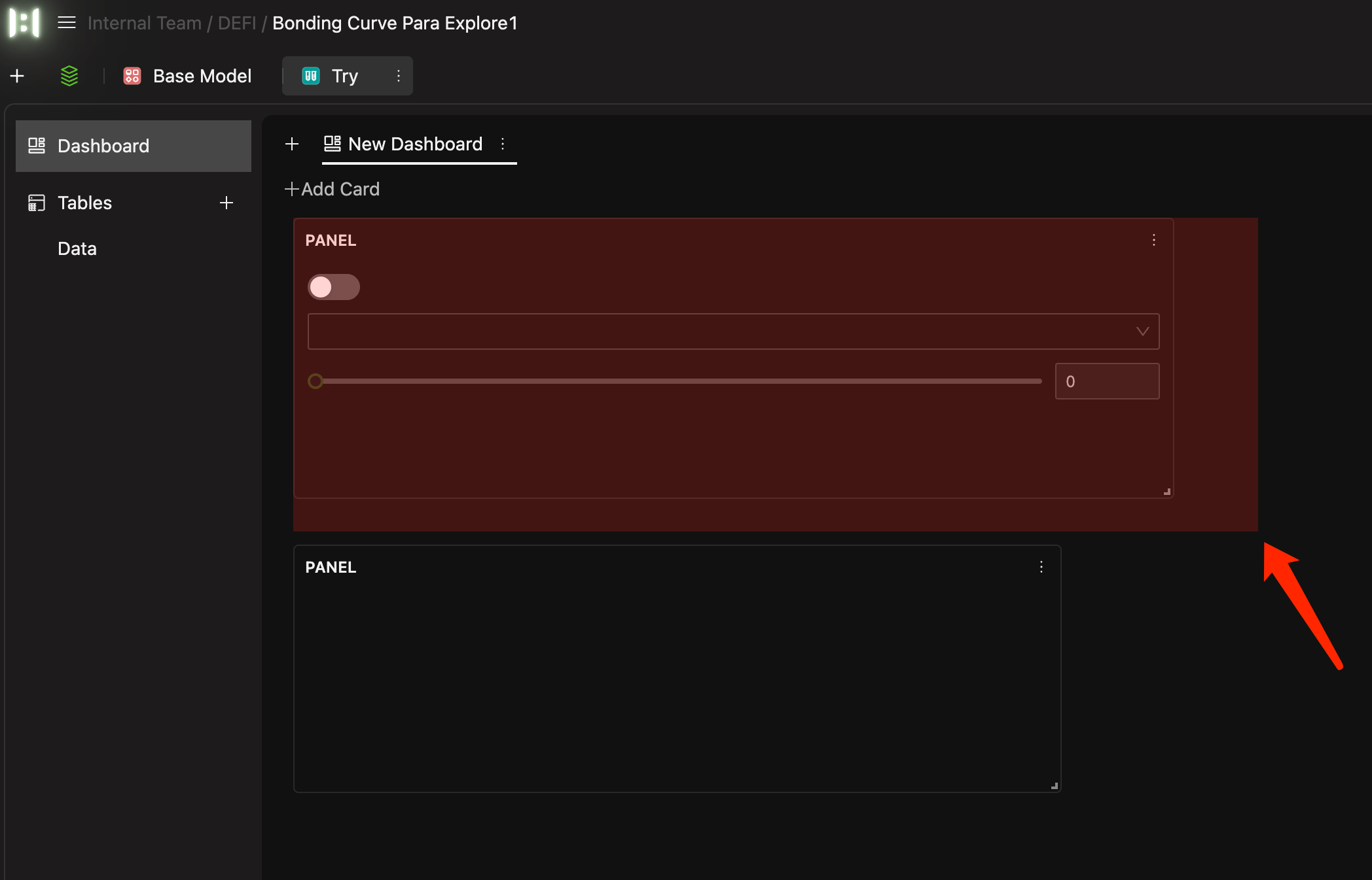
Adding Cards: Once you add Chart Cards or Panel Cards to a dashboard, you can:
- Drag the cards themselves or their outlines to adjust their position and size.
- The dashboard features an auto-flow layout, which intelligently arranges cards by prioritizing upward and leftward placement to efficiently fill available space.
 Tip
TipFor details on creating different card types, see Section 4.3 "Configuring Chart Cards" and Section 4.4 "Configuring Panel Cards".
-
Shared Card Configurations Across Dashboards: Within a single Parameter Exploration experiment, you can create multiple dashboards. However, all these dashboards share the same underlying set of Panel Card and Chart Card configurations. This means that the experiment results displayed will not differ based on where a card is placed (i.e., on which dashboard), but rather on the parameters set via the Panel Cards. The dashboards primarily offer different ways to organize and view these shared cards.
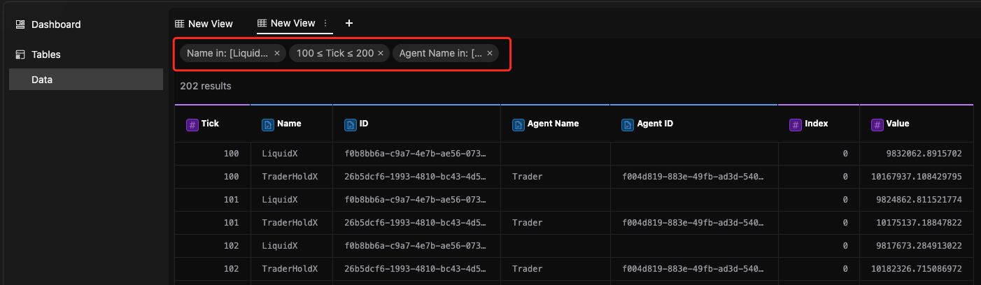
Preparing Your Data for Visualization
Here are the key areas you'll use when working with your experiment data:
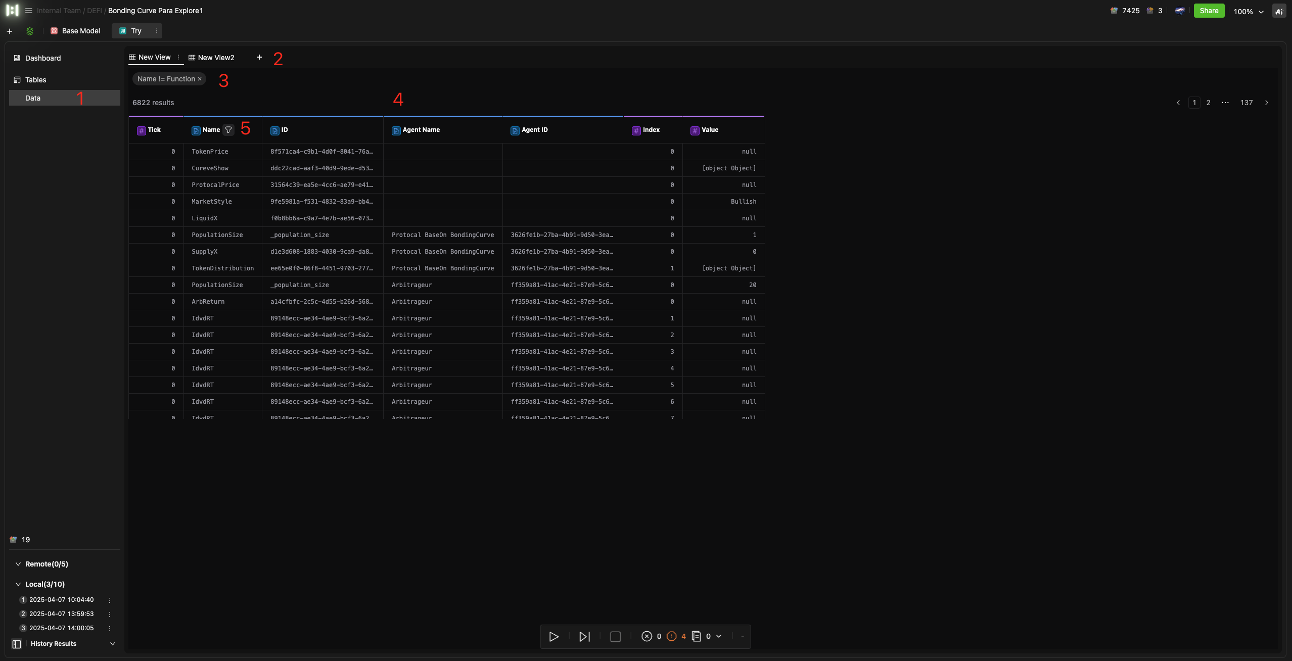
| # | Area | Function |
|---|---|---|
| 1 | Data Sources | Lists all data tables (e.g., the primary Data table, imported tables) |
| 2 | View Header | Shows the name of the active Data View. Often includes a "+" button to create a new Data View. |
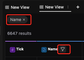
| 3 | Filter Tags | Visibly presents all active filter conditions for the current Data View. Allows quick removal of individual filters through X on a tag. |
| 4 | Data Preview Area | Displays the content (rows and columns) of the selected data table or Data View. |
| 5 | Filter Icon | Accesses filter options (often a funnel icon) for that field. |
Accessing Your Data Sources
-
The Primary Output: The
DataTable- After each experiment run, HoloBit automatically saves the detailed output records to the built-in Data table.
- This
Datatable is always present, cannot be deleted, and stores all raw simulation results. It's found in the Data Source List.
-
Additional Data Tables
- The Data Source List will also display any other tables you might have imported or created (e.g., by loading external files or merging tables).
-
Previewing Data
- Selecting any table from the Data Source List displays its content in the Data Preview Area.
Creating and Managing Data Views
A Data View is like a saved, filtered version of your experiment's main data table. After your experiment generates many data entries, you can create a Data View to specify exactly which of those entries you want to focus on. This selected data then becomes a clean and simple source for building your charts.
- Independent Views: A single data table can have multiple Data Views derived from it. These views are independent of each other; changes in one view do not affect others.
- Views are Optional: Charts can also directly use the original, unfiltered data table as their source. Data Views are not mandatory.
- Create New / Save As:
- Click the "+" button in the View Title Bar to create a new, empty Data View.
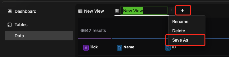
- Alternatively, you can save an existing view with its current filters as a new, duplicate view (similar to a "Save As" function).
- Click the "+" button in the View Title Bar to create a new, empty Data View.
Adding Filter Conditions
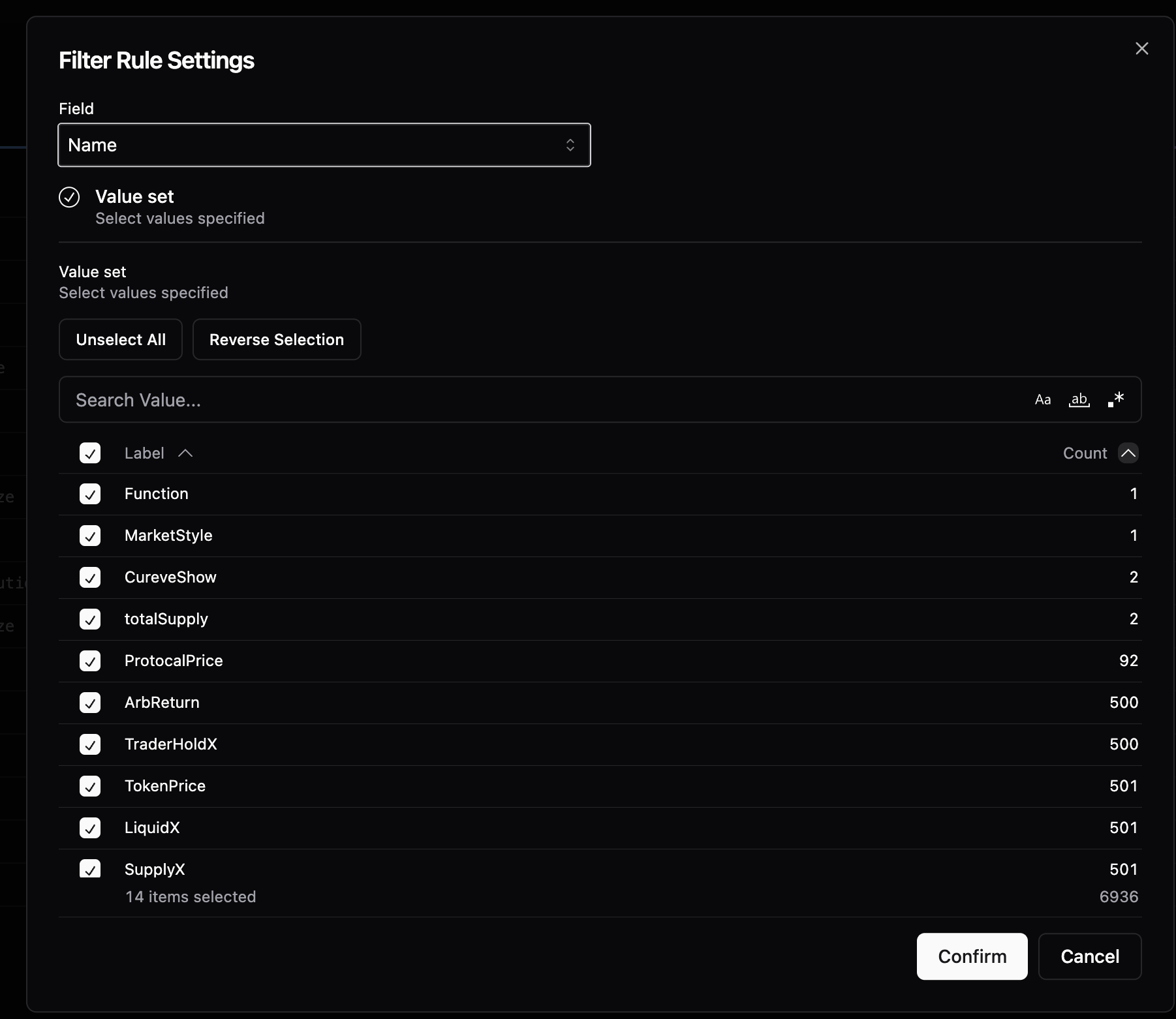
- Accessing Filters: In the Data Preview Area, hover over a column header (field). A funnel icon will appear. Click this icon to open the filter conditions window for that specific field.
- Numeric Fields: Support conditions like defining a range (e.g.,
value >= x AND value <= y), greater than, less than, equal to, etc.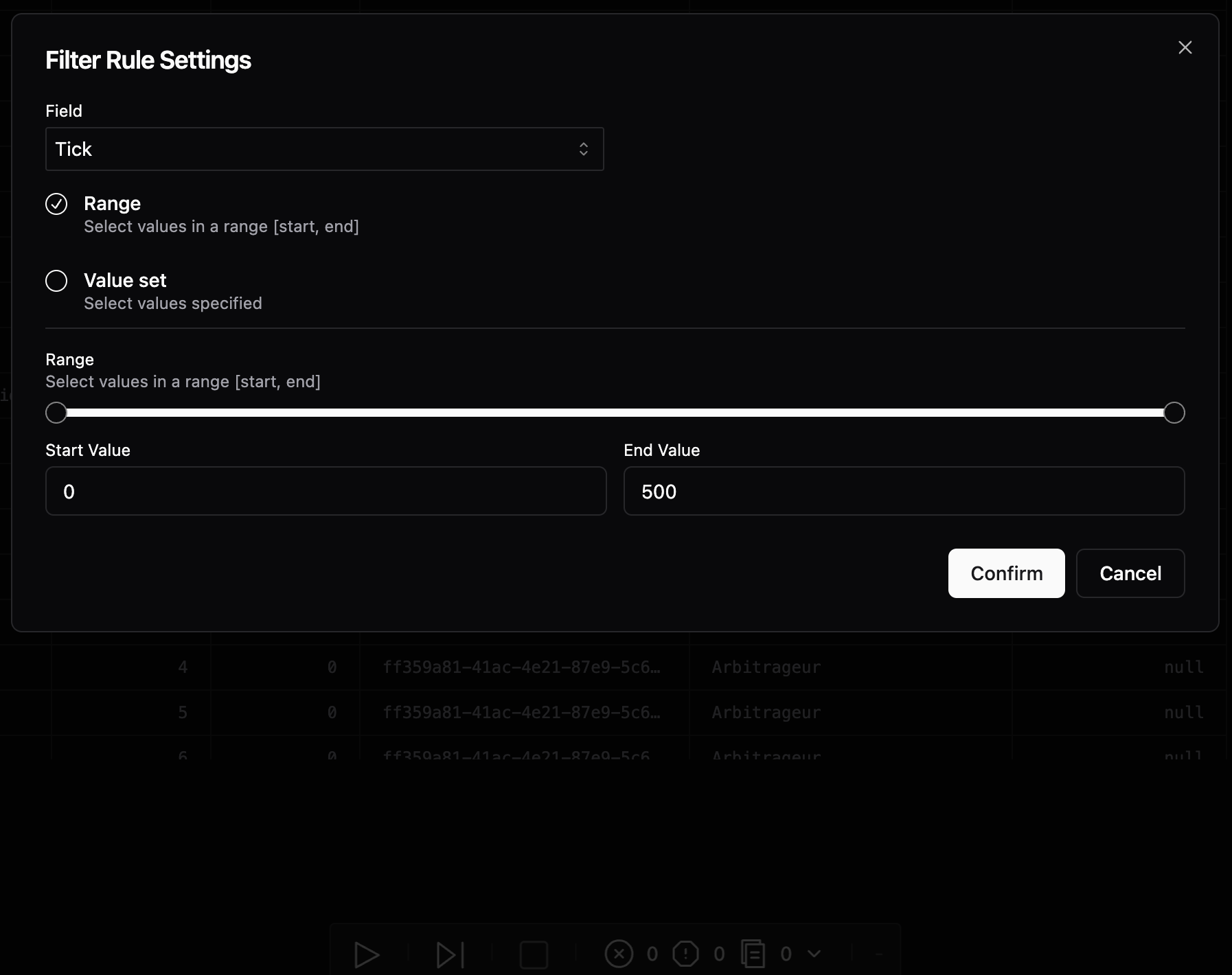
- Text Fields: Support multi-select from a list of distinct values. You can also use the search box to input keywords for fuzzy matching to find and select relevant values.
- Applied filter conditions will be displayed as tags in the Filter Tags Area. You can click the "X" on any tag to remove that specific filter.
Understanding Output Data
- The final output of an experiment is written to the
Datatable. - The Data table structure specific to Parameter Exploration includes fields such as:
| Field Name | Type | Description |
|---|---|---|
Tick | quantitative | Represents the simulation time step. |
Name | nominal | The name of the data object |
ID | nominal | The unique identifier of the data object within the model. |
Agent Name | nominal | The name of the Agent to which the data object belongs. |
Agent ID | nominal | The unique identifier of the Agent to which the data object belongs. |
Index | quantitative | The specific index of an individual instance of an Agent (if applicable, e.g., for agent populations). |
Value | quantitative | The value of the data object at that Tick. |
Each data entry in the Data table records the state of a data object at a specific Tick. This data can be directly used for plotting charts or exported for further analysis.
Configuring Chart Cards
Chart Cards are used to visualize the data generated by your experiments.
Creating and Managing Chart Cards
-
Create New Chart Card:
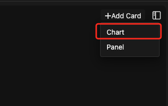
- Select the target Dashboard where you want to add the chart.
- Hover over the "+" (Add Card) button, typically in the top-right corner of the Dashboard.
- Select Chart from the menu.
- This creates a new Chart Card and immediately opens its editing window.
-
Manage Existing Chart Cards:
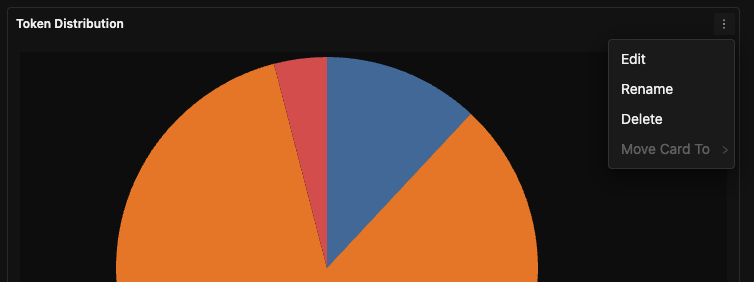
- For an existing Chart Card, click the kebab menu ( ⋮ ) in its top-right corner.
- Options typically include: Edit, Rename, Delete, Move Card To (to move it to a different dashboard).
- Selecting Edit will open its editing window.
-
Save and Exit Editing: After configuring the chart, click Confirmto save your settings and return to the dashboard view.
Understanding the Chart Editing Interface
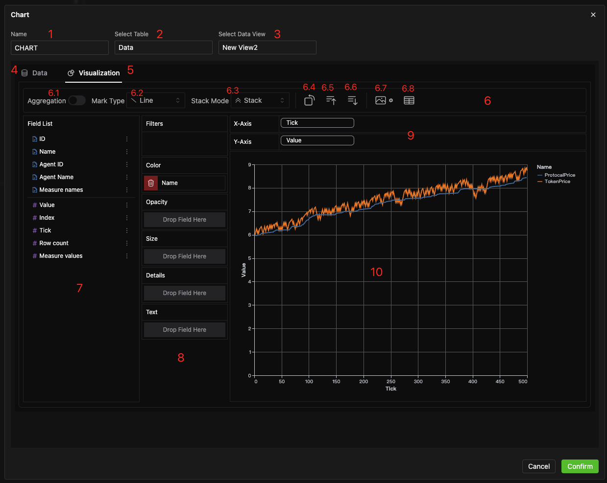
| # | Area | Function |
|---|---|---|
| 1 | Card Name | Edit the title of the Chart Card. |
| 2 | Data Table Dropdown | Select the source data table for plotting (e.g., the default Data table). |
| 3 | Data View Dropdown | Select a specific Data View (pre-filtered version of the table) to use. This is optional; you can use the raw table. |
| 4 | Data Preview Tab | Expand/collapse to preview the source data. Refer to Section 4.3.1 for details on the data preparation interface. |
| 5 | Visualization Tab | Expand/collapse the main chart configuration area. |
| 6 | Chart Toolbar | Access various chart settings and tools (see Section 4.3.3 below). |
| 7 | Field List Area | Lists available data fields (dimensions are often shown in blue, measures in purple). Drag fields from here to the shelves below. |
| 8 | Style Shelves | Visual channels like Color, Size, Opacity, Text. Drag fields here to encode data. |
| 9 | Dimension/Measure Shelves | Coordinate channels like X-axis, Y-axis, Series. Drag fields here to define the chart structure. |
| 10 | Chart Preview Area | Displays a real-time preview of the chart as you configure it. |
Chart Toolbar
Commonly used operations include 8 buttons: 6 for configuration + 2 for export.
| Function | Description |
|---|---|
| Aggregation Switch | When turned on, allows you to apply aggregation functions (e.g., avg, sum, max) to measure fields. |
| Chart Type Selection | Choose the type of chart (e.g., Line, Bar, Stacked Bar, Scatter Plot). |
| Stack Mode Selection | For applicable charts (like bar/area), choose between normal stacking or percentage stacking. |
| Transpose Button | Swap the fields on the X and Y axes (or equivalent dimension/measure axes). |
| Ascending Sort Button | Sort the chart by a dimension or measure in ascending order. |
| Descending Sort Button | Sort the chart by a dimension or measure in descending order. |
| Export as PNG | Export the current chart view as a PNG image file. |
| Export as CSV | Export the data currently visualized in the chart as a CSV file. |
HoloBit's charts are powered by Graphic Walker. For users looking to master advanced charting techniques or access comprehensive details on all available features, see the Graphic Walker docs.
Configuring Panel Cards
Panel Cards are used to set initial model parameters or display auxiliary information. They are built quickly by dragging and dropping various control widgets.
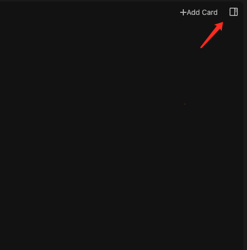
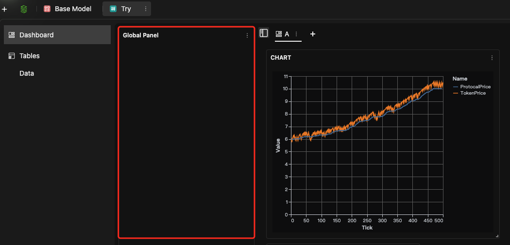
Global Panel
The Global Panel provides a persistent area for controls or information relevant to the entire experiment.
-
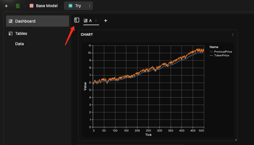
Independent of Individual Dashboards: The Global Panel is a unique panel that operates independently, at the same hierarchical level as your dashboards; it is not a component of any individual dashboard.
- Its expand/collapse button is typically located in the top-right corner of the overall experiment window.
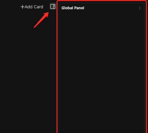
- Once configured and expanded, the Global Panel remains consistently visible in its chosen position (left or right side), no matter which dashboard is currently active.
-
Context Menu: Contains options such as:
-
Edit: Add/configure its widgets.
-
Rename: Change the panel name.
-
Restore default: Reverts all widgets to their saved defaults.
-
Move To Left/Right: Change the docked position; the expand/collapse button moves with it.
-
-
Fixed and Non-Removable: The Global Panel is an integral, built-in part of the experiment interface and cannot be deleted by the user.
Creating and Managing Panel Cards
These are the regular Panel Cards that you add to your individual dashboards. Panel Cards are added directly to your dashboards, just like Chart Cards. Both types of cards are components of the currently selected dashboard.
-
Create New Panel Card:
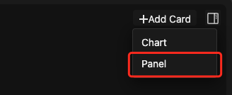
- On the target dashboard, hover over the "+" (Add Card) menu in the top-right.
- Select Panel from the menu.
- This creates a new Panel Card and opens its editing window.
-
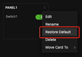
Manage Existing Panel Cards:
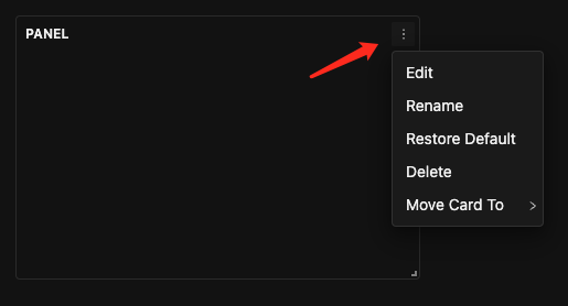
-
Click the kebab menu ( ⋮ ) in the top-right corner of an existing Panel Card.
-
Options typically include: Edit, Rename, Restore Default (reverts controls to their saved default values), Delete, Move Card To.
-
Select Edit to enter its editing window.
-
Understanding the Panel Editing Interface
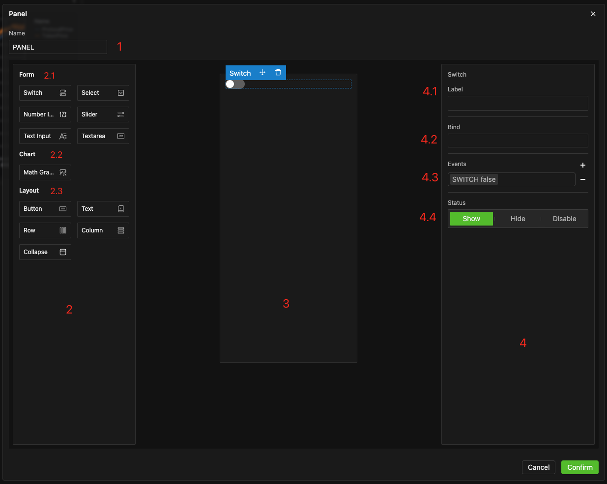
| # | Area | Function |
|---|---|---|
| 1 | Panel Name | Edit the title of the Panel Card. |
| 2 | Widget Palette | Drag widgets (like input fields, sliders, layout elements, and text boxes) from this palette onto the Panel Canvas to build your panel. |
| 3 | Panel Canvas | The main area where you place and arrange widgets to build your panel. |
| 4 | Properties Pane | When a widget on the canvas is selected, this pane displays its configurable settings: Label, Bind Field (for form controls), Interaction Events, Initial Status (Show/Hide/Disable). |
Widget Categories Overview:
| Category | Typical Widgets Included | Purpose & Notes |
|---|---|---|
| Form Controls | Button, Switch, Radio, Select/Dropdown, Number Input, Slider, Text Input, Textarea | Collect user input and write it to model parameters. |
| Graph Widgets | Math Function Graph | Visualize mathematical functions in real-time, often to show the relationship between parameters and function shapes directly on the input panel. |
| Layout & Text Widgets | Row, Column, Text, Collapse, Slides | Row/Column/Collapse: Group multiple widgets for organized layout (auto-arranges internally). Text Control: Used for labels, titles, descriptions, or as a simple separator/spacer card. |
Widget Settings
When you select a widget on the Panel Canvas, its configurable settings appear in the Properties Pane (Area #4 in the Panel Editing Interface). These properties allow you to customize the widget's appearance, behavior, and how it interacts with your model and other widgets.
1. Common Properties (Available for Most Widgets):
-
Label/Name:
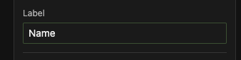
- Purpose: Defines the display name for the widget on the Panel Card. This name is visible to the user.
- Usage: Also serves as an identifier if this widget needs to be targeted by an Interaction Event from another widget. If the Label is empty, other widgets might not be able to select it as a target.
-
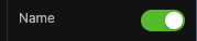
Status (Show/Hide/Disable):
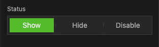
- Purpose: Determines the widget's state when the Panel Card first loads.
- Options:
- Show: The widget is visible and interactive (if applicable). (Default for most)
- Hide: The widget is not visible.
- Disable: (Typically available for Form controls like buttons, inputs, sliders) The widget is visible but grayed out and cannot be interacted with.
For detailed information and examples of each widget type, please refer to their respective sections in this documentation (or a dedicated Components chapter if available).
2. Properties for Form Controls:
-
Bind to Parameter:
- This crucial property links the widget directly to a parameter in your simulation model. When the user changes the widget's value, the linked model parameter is updated automatically.
-
Interaction Events:
-
Core Concept: Trigger → Target → Action
- When you configure an Interaction Event, you define:
- The Trigger Event: What on the current widget starts the interaction (e.g., a
Button Click, aSwitch Toggle On,Input Value Meets Condition). - The Target Widget: Which other widget on the Panel Card will be affected. You'll usually select this from a list of available widgets (often identified by their Labels).
- The Action: What happens to the Target Widget (e.g.,
Show,Hide,Disable,Enable,Set Value,Expand/Collapsefor a Collapsible Section).
- The Trigger Event: What on the current widget starts the interaction (e.g., a
- Example: For a
Buttonwidget, you might add an Interaction Event where:Trigger Event = Click,Target Widget = MySliderWidget,Action = Show.
- When you configure an Interaction Event, you define:
-
Interaction Capabilities Overview:
-
| Widget | Trigger Widget? | Triggers | Target Widget? | Effect | Assign Value? | Bind To Parameters? |
|---|---|---|---|---|---|---|
| Switch | ✓ | On / Off | ✓ | Show / Hide / Disable | ✓ | ✓ |
| Number Input | ✓ | Value meets condition | ✓ | Show / Hide / Disable | ✓ | ✓ |
| Single-Line Text Input | ✓ | Value meets condition | ✓ | Show / Hide / Disable | ✓ | ✓ |
| Multi-Line Text Input | ✓ | Value meets condition | ✓ | Show / Hide / Disable | ✓ | ✓ |
| Dropdown Select | ✓ | Option selected | ✓ | Show / Hide / Disable | ✓ | ✓ |
| Slider | ✓ | Value meets condition | ✓ | Show / Hide / Disable | ✓ | ✓ |
| Button | ✓ | Click | ✓ | Show / Hide / Disable | ||
| Math Graph | ✓ | Show / Hide | ||||
| Text | ✓ | Show / Hide | ||||
| Row/Column | ✓ | Show / Hide | ||||
| Collapse | ✓ | Show / Hide, Expand / Collapse | ||||
| Slide | ✓ | Show / Hide, Custom State Change (if applicable) |
Refer to the specific documentation for Form Control events for more details.
Automatic Layout
- Widgets are stacked vertically by default (from top to bottom).
- If an upper widget is hidden, the widget(s) below it will automatically shift upwards to fill the empty space. Conversely, if a hidden widget is shown again, widgets below it will shift downwards to make room.
A Panel Card can even contain just a single Text widget (e.g., Text or Text Input widget type). This is a flexible way to display instructions, section titles, or create visual separators, with no practical limit on the number of widgets.
Running the Experiment
- Client-Side Execution: Parameter Exploration experiments default to running computations locally in your web browser.
Parameter Value Sources Before a Run
Each time you click the Run button, the input parameter values used by the model can originate from one of the following four scenarios. The system captures a snapshot of these inputs and logs them with the output data in the experiment record:
| Parameter Value Source | When It Occurs | |
|---|---|---|
| ① | Panel's Default Values | Immediately after creating the experiment or after restoring defaults and then running. |
| ② | Temporarily Modified Values | After manually adjusting controls on the current panel and then running. |
| ③ | Run Record's Settings | After loading an old record from the records list and then running directly. |
| ④ | Run Record + Further Edits | After loading an old record, making further adjustments to controls, and then running. |
Execution Steps
- Click the Play ► button on the Run Control Bar.
- After the experiment finishes (client-side), the results are written to the
Datatable, charts are refreshed, and a new run record is generated.
Records and Reproducibility
Managing Default Settings (Relevant only to Panel Cards)
Default settings only affect the initial values of widgets on Panel Cards.
- Modifying Defaults: In the Panel Card's Edit Mode, directly adjust the control's initial value. This new value is then saved as the new default.
- Overwriting Defaults with Current Run Values: After a run, if you want to set the parameters used in that specific run as the new defaults, select Set as Default from the experiment records list.
- Restoring Defaults:
- Single Panel Card: From the panel card's menu ( ⋮ ), click Restore Default. This only affects the current panel.
- All Panel Cards (Experiment-wide): In the experiment records list, double-click the record (if one exists representing the initial state) or click its menu and select Load. This restores all panel values across the experiment to their saved defaults.
- Single Panel Card: From the panel card's menu ( ⋮ ), click Restore Default. This only affects the current panel.
Experiment Records and Reproducing Results
Parameter Exploration experiments automatically generate run records after each run. For comprehensive information on managing, accessing, and utilizing these records, please refer to 2.5 Experiment Records and 4.5 Managing Experiment Records in the Experiments chapter.
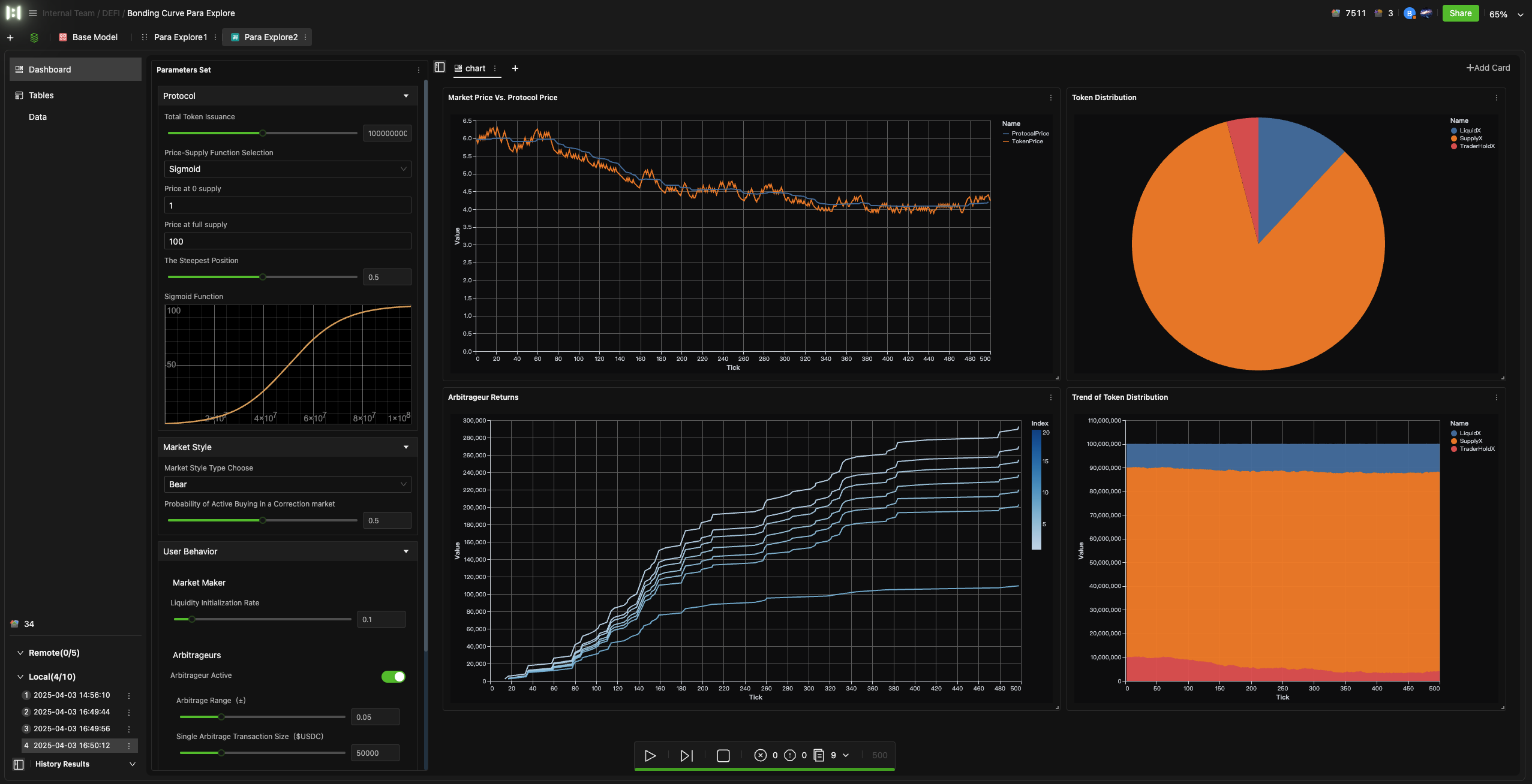
Example: Bonding Curve
A Bonding Curve is commonly used in DeFi protocols to define the price-supply relationship defined by a mathematical curve. This experiment example comes pre-configured with core controls, allowing you to freely adjust:
- Function type
- Curve parameter values
- Protocol parameters
- Market scenarios (e.g., bullish, bearish)
- User behaviors
After clicking Run, the charts will simultaneously display output curves for:
- Market Price vs. Bonding-Curve Price
- Token Holdings Distribution
This helps you assess the impact of different parameter combinations on the token economy. View here