Layout Containers
Overview
Layout containers are parent-level widgets designed to hold and organize multiple child widgets within a panel card. They automatically arrange these child widgets according to a preset direction or mode, and let you collectively move, show/hide, disable, or bind unified interactions for all child widgets.
Types of Layout Containers
HoloBit provides several types of layout containers, each with a distinct arrangement behavior.
Row
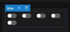
- Arrangement
- Arranges child widgets horizontally (left to right). Child widgets will wrap to a new line when exceeding container width.
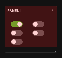
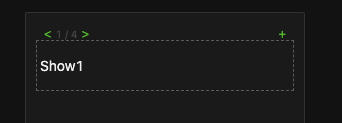
- Dynamic Resizing (Use Mode)
- In Use Mode, if the Panel Card's size changes, the child widgets within a Row layout will dynamically reflow and rearrange themselves to fit the new dimensions (as shown in the right image).
- Dynamic Repositioning
- If a preceding widget within the Row is hidden, subsequent widgets automatically shift to the left to fill the space. When a hidden widget is shown again, subsequent widgets shift to the right to accommodate it.
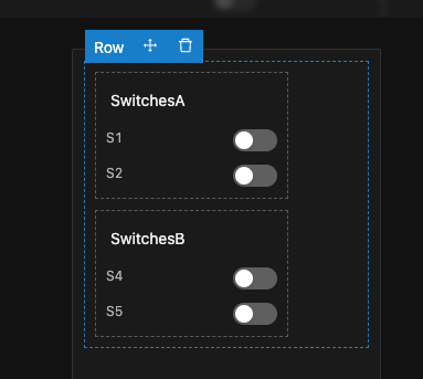
Column
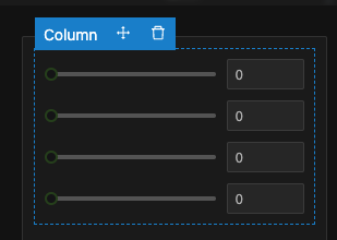
- Arrangement: Arranges child widgets vertically (top to bottom).
- Dynamic Repositioning: If a preceding widget (above) within the Column is hidden, subsequent widgets automatically shift upwards. When a hidden widget is shown again, subsequent widgets shift downwards.
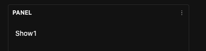
Collapse
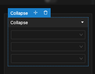
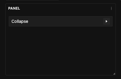
- States
- Supports two states, Expand and Collapse.
- When collapsed, all child widgets within it are hidden (as shown in the right image).
- Toggle Methods
- The state can be toggled in two ways:
- User Click: The user clicks directly on the title bar of the Collapse.
- Interaction Event: Triggered by an interaction event from another widget.
- The state can be toggled in two ways:
- Internal Layout
- Child widgets inside a Collapse are arranged according to the same principles as a Column layout (vertically).
Slides
- Multi-card Structure: Allows you to add multiple slides. Only one card is visible at a time.
- Navigation: Users can switch between cards, typically via interaction events triggered by other controls to navigate to a specific card.
- Internal Layout: The arrangement of child widgets within each individual slide follows the same principles as a Column layout.
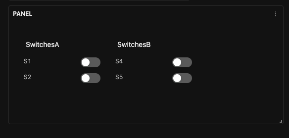
Need to show or hide multiple widgets at once?
Simply target their parent container instead of setting up each widget individually. For example, use a single dropdown selection to reveal an entire group of related controls.
Configuration Steps
General Operations
Adding and Removing Widgets
- Adding by Dragging New Widgets: Drag widgets from the Widget Palette directly into the layout container.
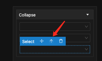
- Add by Moving Existing Widgets: Select an existing widget on the canvas, then use its "Move" handle and drag it into the desired layout container or new position.
- Removing Widgets: Standard deletion operation applies—select any widget and click its general "Delete" icon.
Nesting Containers
Layout containers can be nested within one another, allowing you to create complex, multi-level structures. For example, you might place several Column layouts inside a single Row Layout, with each Column then holding its own set of individual widgets.
-
Building Nested Structures
Simply drag one layout container (e.g., a Column layout) from the palette and drop it inside another layout container. Alternatively, move an existing layout container (using its 'Move' handle) into another.
-
Navigating Up the Hierarchy
If you have a widget (or a nested container) selected, look for an "↑ (Select Parent)" icon, typically located on its contextual action bar. Clicking ↑ will deselect the current widget and select its parent container.
-
Other general settings for layout containers are configured similarly to standard widgets.
Configuring Options for Collapse
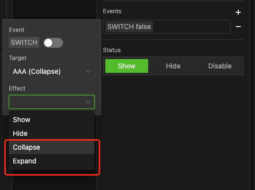
- Expand/Collapse via Interactions:
- Set up an interaction event on a trigger widget.
- In the event's configuration, set the Target widget to be your Collapse container.
- For the Effect, choose Expand or Collapse.
- This allows you to programmatically expand or collapse the container, effectively showing or hiding its contents with a single click from the trigger widget.
Configuring Options for Slides
Editing Slides
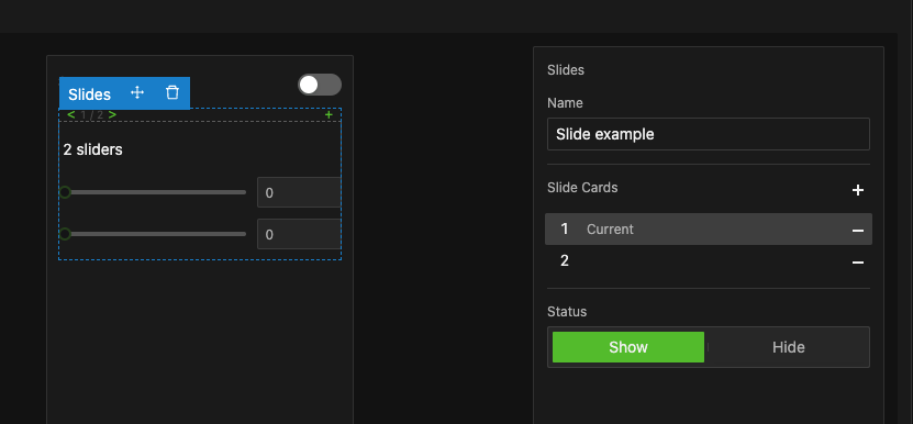
- Add/Remove Slides: In the "Slide Cards" section of the Slide container's Properties Pane:
- Click "+" to add a new slide card.
- Click "-" to delete the currently selected slide card.
- Select a Slide for Editing: Click on a slide number in the list. The Properties Pane will indicate it's the current slide, and the main panel canvas will switch to display that specific slide's content.
- Add and Arrange Widgets: You can then freely add or arrange child widgets on the currently selected slide, just as you would on a regular panel.
- Repeat this process to construct the content for all slide cards.
Slide Switching Interactions
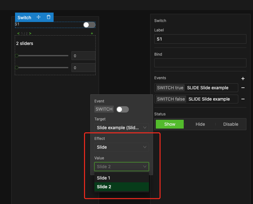
To switch between slides:
- Set up an interaction event on a Trigger widget.
- In the event configuration:
- Set the Target widget to your Slides.
- For the Effect, choose Slide.
- A new field labeled "Value" will appear. This field refers to the target slide card number. From its dropdown menu, select the slide card number you wish to navigate to when this interaction event is triggered.
- Other options (trigger condition, etc.) follow standard event setup.
- Create Slides: Following the steps above, create a Slide Container named
Slide exampleand add two slides. - Add Widgets:
- Card 1: Add two Sliders.
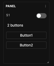
- Card 2: Add two Buttons.
- Configure Switch S1 Interaction: On a Switch widget (labeled
S1), set up two interaction events:- Event 1 (Switch On):
- Target:
Slide example. - Effect: Slide.
- Value: Card 1.
- Target:
- Event 2 (Switch Off):
- Target:
Slide example. - Effect: Slide.
- Value: Card 2.
- Target:
- Event 1 (Switch On):
- Result:
- When the
S1switch is turned on, Slide 1 (with sliders) will be displayed. - When
S1is turned off, Slide 2 (with buttons) will be displayed.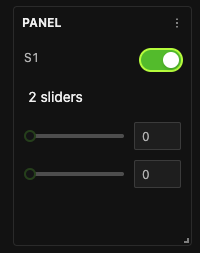
- When the
Example
An interactive example demonstrating the Collapse container is provided within the 'Bonding Curve Example' in the Experiments chapter.