Form Controls
Overview
Form controls are interactive widgets that you can add to panel cards within an experiment dashboard. They serve two primary functions:
-
Set Initial Values for Model Data Objects: Before an experiment run, these controls allow you to input or modify the starting values that will be assigned to your model's parameters.
-
Trigger Interactions with Other Widgets: They can initiate actions on other widgets on the same dashboard, such as changing their visibility (show/hide/disable) or setting their values.
Widget Types and Trigger Actions
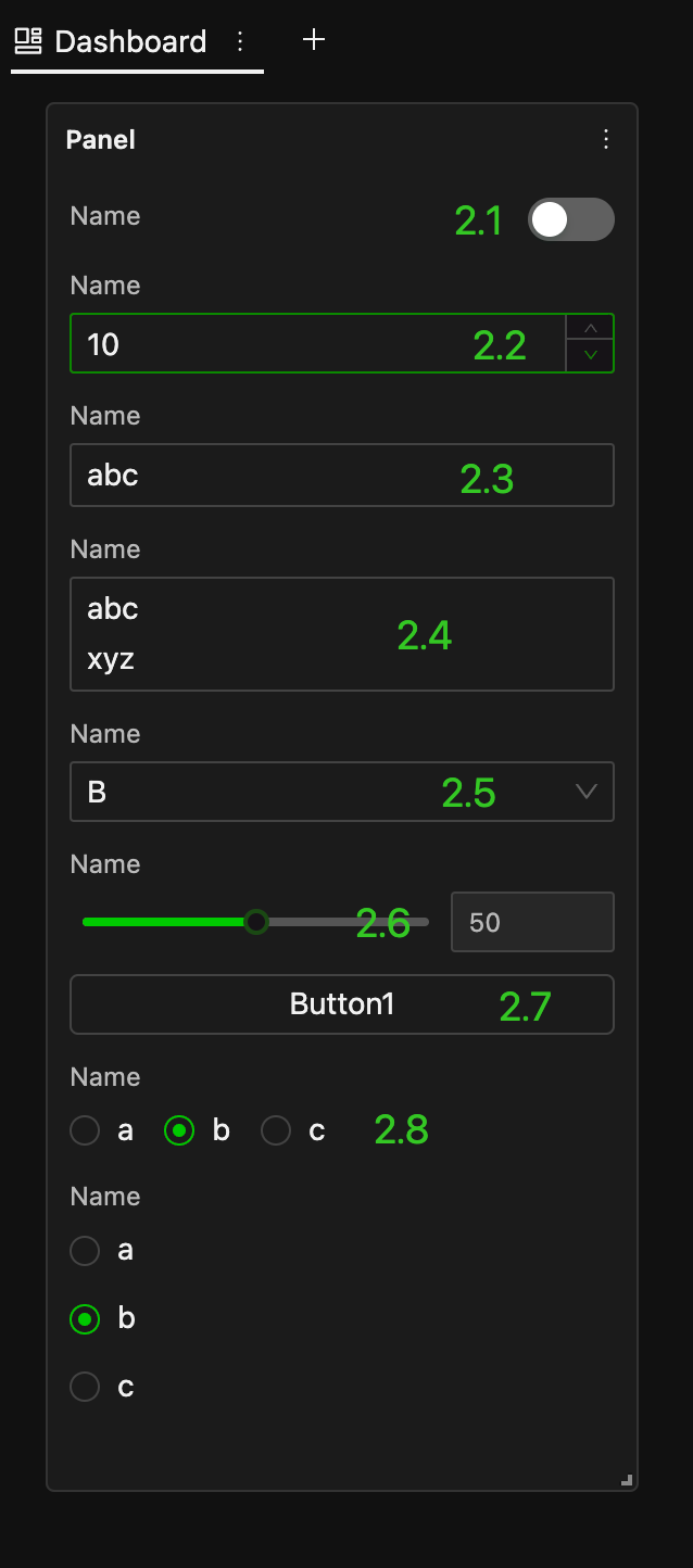
The following table summarizes common Form controls available in HoloBit Panel Cards, their value types, typical trigger events, and illustrative examples (where applicable).
| Ref. | Widget Type | Value Type | Typical Trigger Event(s) | Illustration |
|---|---|---|---|---|
| 2.1 | Switch | Boolean | Toggled On/Off (onChange) |  |
| 2.2 | Number Input | Number | Input Finalized (onBlur) |  |
| 2.3 | Single-Line Text Input | String | Input Finalized (onBlur) |  |
| 2.4 | Multi-Line Text Area | String | Input Finalized (onBlur) |  |
| 2.5 | Select | String/Number/Boolean | Selection Changed (onChange) |  |
| 2.6 | Slider | Number | Value Changed (onChange, supports drag or keyboard input) |  |
| 2.7 | Button | (No data binding) | Clicked (onClick) |  |
| 2.8 | Radio | String/Number/Boolean | Selection Changed (onChange) | 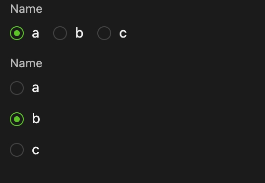 |
Configuration Steps
Beyond universal widget settings (like Label and initial State), Form controls have specific configuration options detailed below.
Binding to Model Data Objects
Most Form controls (except for Buttons, which primarily trigger actions) can be bound to a data object (parameter/variable) within your simulation model. This binding allows the control's value to directly set the value of the linked model data object.
Steps to Bind a Control
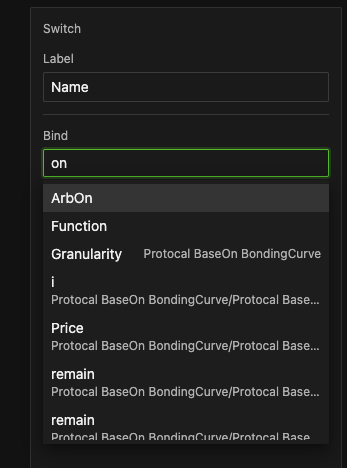
Step 1. Select the Widget: On the Panel Canvas, click the Form you want to configure.
Step 2. Access Binding: In the Properties Pane that appears, locate and click the "Bind" option. This usually opens a searchable list or dialog.
Step 3. Choose the Target Data Object: From the presented list (which is typically searchable):
-
Primary text: Object name (e.g.,
populationSize,interestRate). -
Secondary (grey) text: Parent Entity / Process(e.g.,
Agent: Investor / Process: DecisionMaking)
Step 4. Confirm Binding: Once selected, the Properties Pane will typically display the binding:
-
Highlighted object name
-
Parent entity/process in grey parentheses
When the experiment starts (i.e., when you click "Play"), the current value of this widget will be written to the bound model data object, serving as its initial value for that experiment run.
-
Initial value precedence for data objects (highest → lowest):
- Experiment Form Control Value
- Model Controller Configuration
- Individual Properties Settings
- Entity Default Property Value
-
Form controls vs Controller components:
- Form controls only set initial values for the model parameters before the experiment starts. Once the experiment is running, you cannot change these controls, and they cannot affect how the experiment runs. Any changes must be made before starting the experiment.
- This key difference separates form controls from Controllers in model scenarios, which can be adjusted both before and during the simulation, allowing you to change how the model behaves in real-time.
Configuring Options for Select
For a Select widget, you need to define the list of choices available to the user.
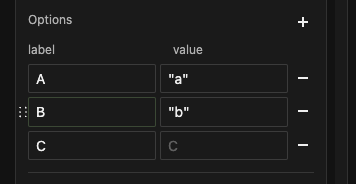
- Click
+ Addto create or- Deleteto remove options. - For each option, you need to specify:
- Label: Visible text in dropdown menu; used as reference in interaction events.
- Value: Data (String/Number/Boolean) sent to bound model parameter; defaults to
Labelif empty.
Setting the Range for Sliders
For Slider widgets, you define the operational range and step size.
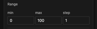
- Minimum Value (
min): The lowest value the slider can represent. - Maximum Value (
max): The highest value the slider can represent. - Step (
step): The increment by which the slider's value changes.
Configuring Interaction Events
Interaction events allow you to define how one Form control (the Trigger) affects another widget (the Target) on the same dashboard by applying an Effect.
For a comprehensive table which widgets can trigger actions and be targeted, and what effects are possible, refer to the table of Interaction Capabilities Overview in the Parameter Exploration > Widget Settings > Interaction Events section.
Steps to Set Up an Interaction Event
Step 1: Add New Event
Click the + to create or - to delete an event.
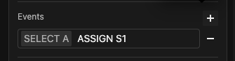
Step 2: Configure the Event
A configuration dialog or set of dropdowns will appear, requiring you to specify the following three aspects:
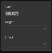
-
Event (Trigger)
- From the Event selection dropdown, choose the action on the current widget that will initiate the interaction.
- The available trigger actions depend on the type of widget you are configuring. Refer to the "Triggers" in the table of Interaction Capabilities Overview mentioned above. (The actual interface might present these differently based on widget type).
-
Target
- Select the widget that will be affected by this interaction event. You can choose from a list of other widgets that have already been added to the Global Panel or the current Dashboard Panel and have a
Labelset. - Example: In the image below, a slider named "S1 (Slider)" is selected as the target.
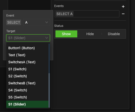
- Select the widget that will be affected by this interaction event. You can choose from a list of other widgets that have already been added to the Global Panel or the current Dashboard Panel and have a
-
Effect
- This defines what happens to the Target widget. The available effects depend on the capabilities of the target widget as outlined in the "Target Widget?" column in the table of Interaction Capabilities Overview.
- State Change
- If the target widget supports state changes, you can choose effects like
Show,Hide,Enable,Disable. For layout widgets, additional options likeExpand/Collapseor custom states might be available. - For state-change effects, typically no additional parameters are required.
- If the target widget supports state changes, you can choose effects like
- Value Assignment
-
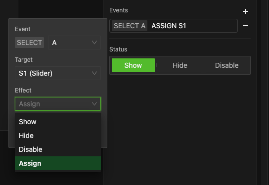
If the target widget supports receiving a value (e.g., another Form control), you can choose an
Assign(or similar) effect. For example, in the image below, the effectAssignis chosen for the target slider "S1".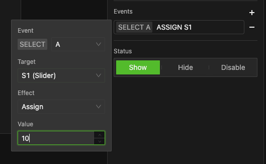
-
For value-assignment effects , input a compatible value based on the target widget's data type. Example: Enter numerical values for Sliders, Boolean (true/false) for Switches, or String values for Text fields.
-
- This defines what happens to the Target widget. The available effects depend on the capabilities of the target widget as outlined in the "Target Widget?" column in the table of Interaction Capabilities Overview.
Let's illustrate with a common scenario: selecting an option in a dropdown sets the value of a slider.
Step 1: Configure the Select Widget ("MyDropdown")
- Add an option with
Label = AandValue = 10.
Step 2: Configure the Slider Widget ("S1")
- Ensure it has a label (e.g., "S1").
- Keep its default range and step, or set as needed (e.g., min 0, max 100, step 1).
Step 3: Create the Interaction Event on "MyDropdown"
- Select "MyDropdown". In its Properties Pane, add a new Event.
- Event:
Select→Option A. - Target:
S1 (Slider). - Effect:
Assign→Value =10.
After these three steps, the event is now active: When the user selects option "A" in "MyDropdown", the "S1" slider will automatically jump to the value 10.
You can add multiple interaction events to a single trigger widget or link various widgets in chains to create rich, user-friendly panel experiences.