Basic Charts
Icon

Function
Basic charts allow you to create various visual charts, including line charts, pie charts, and scatter plots. These charts can help you visualize historical trends or the latest status of data objects.
Key Points
Chart Overview
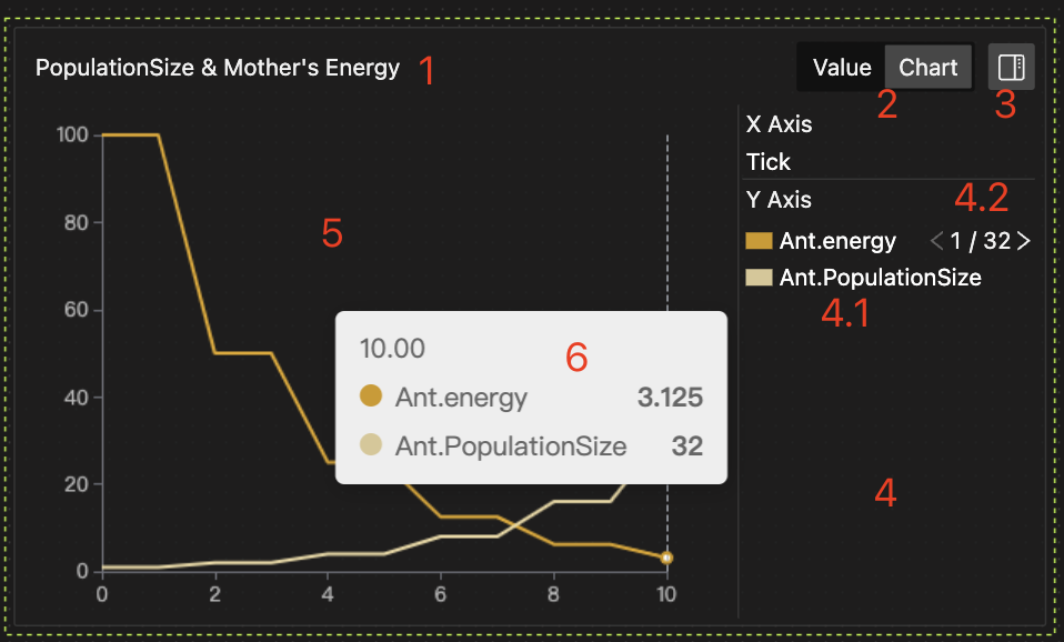
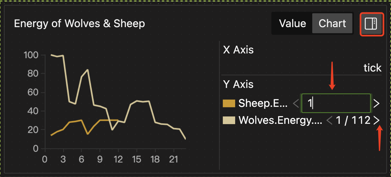
The horizontal and vertical axes are determined by user-specified data objects. The chart includes the following features:
-
Chart Title: Double-click to edit the title.
-
Display Mode Button: Toggle between Chart view and Value view (for the latest data).
-
Legend Area Button: Click to expand and collapse the legend area.
-
Legend Area: Shows data object information for dimensions and metrics. Drag the border to resize.
-
4.1 Legend: Click on the color swatch to show or hide the corresponding data object in the chart.
-
4.2 Entity Individuals Switcher: More details are provided below.
-
-
Chart/Data Display Area.
-
Details about the data point.
Plotting Data
Data Source
Data objects might update their status at the end of each simulation Tick. You can use both the latest and historical data to plot charts.
Historical Data Plotting
This will display the trend of a data object over system time, with the horizontal axis representing Tick or Now (as shown in the left image below). Or, it will show the historical correlation between data objects, with both the horizontal and vertical axes representing specified data objects (as shown in the right image below).
Latest Data Plotting
This will display the latest status (comparison) of one or more data objects.
Data Types
- Dimensions (e.g., X-axis in line charts) can be any simple data type, and only one data object can be specified per chart.
- Metrics (e.g., Y-axis in line charts) must be Number type, and multiple metrics can be specified in a single chart.
- More details on data formats are shown in the table below.
| Plotting Method | Dimension Selection | Dimension Format | Measure Format | Illustrative Example |
|---|---|---|---|---|
| Historical Data | Specify Value object | Number/Datetime | Number |
|
| Historical Data | Specify Value object | Number/Datetime | Dict (automatic) |
|
| Latest Data | By field name | (Data object name, String) | Number |
|
| Latest Data | By field name | (Data object name.key name, String) | Dict (automatic) |
|
| Latest Data | Specify List object | [Number] | [Number] |
|
Plotting Order
-
By Dimension Value
-
The system sorts data in (ascending) order of dimension values (e.g., X-axis in line charts) and plots the chart, akin to
data.sortby(X_value). -
Dimension values may repeat. The system provides methods to aggregate metric values for the same dimension value, such as latest, minimum, average, etc., ensuring unique metric values relative to dimensions, akin to
data.groupby(X_value).method(). (Only scatter plots can skip aggregation.)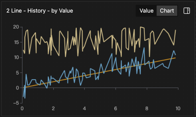
-
-
By Record
-
The system plots data in the order of generation, with the horizontal axis showing each specific value of the dimension in record order.
-
- The two charts above are based on the same data but plotted in different orders.
- For an X-axis with [1, 1.5, 2, 3] and a Y-axis with [1, 2, 3, 4], plotting by dimension value results in a step line with closer spacing between the 2nd and 3rd points; plotting by record results in a straight line with equal spacing.
For historical data plotting, you can choose either plotting order; for the latest data plotting, the system only plots in record order.
Support for Dynamically Changing Chart Type
You can switch the chart type based on the same plotting data to display the results in real time.
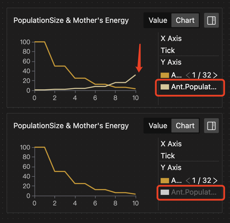
Support for Viewing the Entity Population
-
Display Individual Properties
-
The chart supports quickly switching between individual entities to view their property values.
-
You can click the button in the top right corner to extend the legend bar. Then, click the individual switch button to change the displayed individual data.
-
Alternatively, double-click the individual serial number to directly enter the individual ID you want to view and change the displayed individual data.
-
-
Supports Real-time Changes in Entity Creation and Destruction
The chart dynamically updates to add data for the created individuals and stops showing data for the destroyed individuals within the entity population.
Setup Methods
The settings include selecting the chart type, plotting data, and plotting order.
Selecting Chart Types
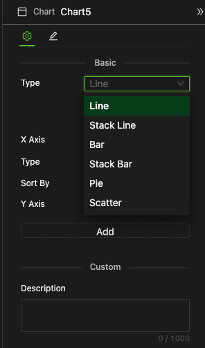
You can select it from a dropdown menu, as shown in the image above.
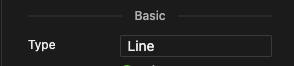
Line Charts
Selecting Plotting Method
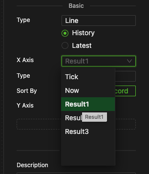
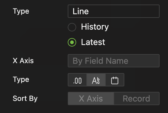
Single-Selection: History (by historical data ) or Latest (by latest data)
X-Axis Configuration
-
Historical Data Plotting
-
Specify Data Object
The horizontal axis can specify the data object in any simple data type or the key of a Dict to get the corresponding value, such as the built-in variable
Tick. -
Specify Data Type
Number, String, or DateTime.
-
To use system calendar time as the horizontal axis in your chart, configure the system calendar time in the global settings to enable effective plotting.
-
Latest Data Plotting
-
By Field Name
Use the names of Y-axis selected data objects as Dimension values, while the actual values of Y-axis objects are as metric values.
-
By Specifying a Variable in [Number] type
- Specify a variable in [Number] type as Dimension values, and then select a variable in [Number] format of equal length.
-
For comprehensive format compatibility, refer to the Data Type Table.
-
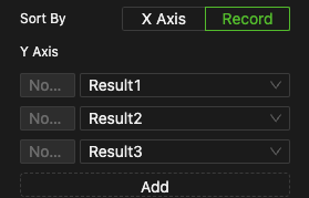
Plotting Order

- Sort by: Select between by X-Axis and by Record
- For historical data plotting, either order can be selected.
- For the latest data plotting, only record order is applicable.
Y-Axis Configuration
The vertical axis configuration remains the same regardless of the horizontal axis configuration.
-
Add Object
Click the "Add" button to add a new object.
-
Select Target Object
-
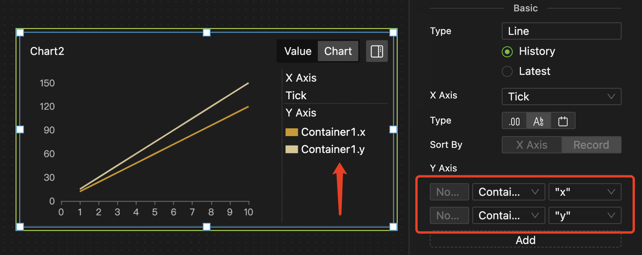
According to the table of Data Types, the Y-axis should be a Number type, allowing direct selection of matching data objects from the dropdown list, as shown below.
-
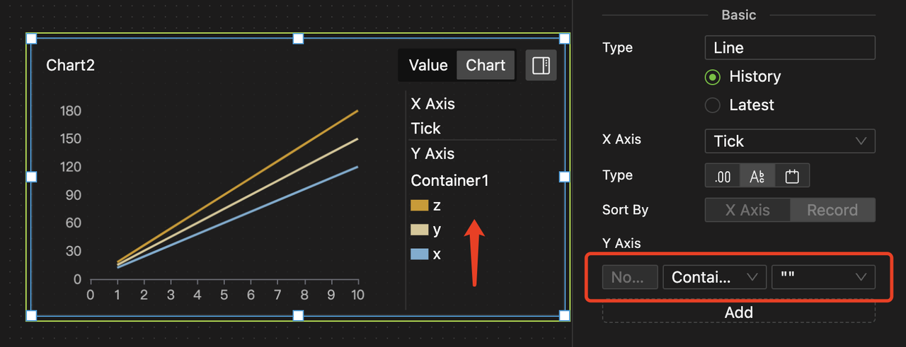
For variables in Dict type or containers, the system supports plotting key-value pairs, using keys as the series name or the values of the Number type as the data. There are two ways to set the Y-axis.
-
After selecting the target object, you can specify the corresponding keys (constructed) for the values of the Number type in a secondary selection to ensure deterministic plotting.
-
Alternatively, you can skip the secondary selection, allowing for dynamic plotting. In this case, the system will automatically plot all values of the Number type.
-
-
Since key-value pairs of variables or containers in Dict type can be dynamically added and modified during modeling, dynamic plotting is more suitable for such scenarios than deterministic plotting.
For example, the two charts above plot Container 1, which initially only includes the keys x and y. Therefore, in deterministic plotting, only these two keys can be selected. However, the z key is added to the container during the process, allowing dynamic plotting to visualize it.
-
Specify Aggregation Method
For line charts, when plotting by X-axis value, specify the aggregation method for duplicate X-axis values to avoid confusion. Methods are as follows:
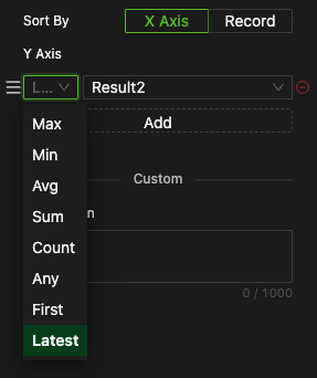
- Maximum
- Minimum
- Average
- Sum
- Count
- Any
- First
- Latest (default)
For plotting by record, there is no aggregation method for Y-axis values.
Stack Line Charts
Same as line chart.
Bar Charts
Same as line chart.
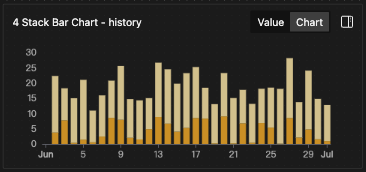
Stack Bar Charts
Same as line chart.
Scatter Charts
- For historical data plotting, the vertical axis values can be configured to avoid aggregation.
Since the system returns the status value of data objects at each Tick, even if the status has not changed, failing to aggregate may result in numerous overlapping data points at the same coordinates.
For example, if you want to use a scatter plot to show the relationship between a trader's single trade yield and prediction accuracy, and the trader makes one trade every 10 Ticks, there are 10 trades in 100 Ticks, but our data will have 100 sets. Aggregating the metric values will yield the desired 10 unique sets of data.
Therefore, unless you need to plot a point for each Tick, you should use the aggregation method for the vertical axis values.
- Other settings are identical to those for Line Charts.
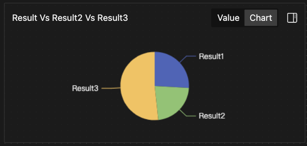
Pie Charts
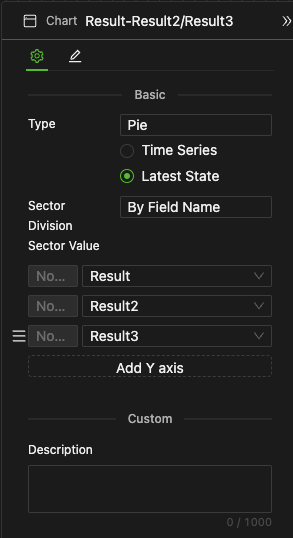
- The setup for pie charts is the same as for line charts.
- However, pie charts are more commonly used for the latest data plotting, aiming to present the proportions of the latest statuses of multiple data objects.
- If a sector value is negative, it will not be displayed.
- Line and stack line charts are usually used with historical data, with the horizontal axis like
TickorNow, to show historical trends. - Bar and stack bar charts are typically used for shorter historical trends. They are also suitable for comparing the latest statuses of multiple data objects, regardless of whether the data is positive or negative.
- Pie charts are often used for the latest data plotting because they effectively reflect the relative proportions of the latest statuses of multiple data objects. Still, they are not suitable for showing positive and negative changes.
- Scatter plots are generally used with historical data plotting, without regard to time series, to reflect the correlation between Y-series and X-series historical trends.
The way you use these different charts depends entirely on your specific requirements.
Examples
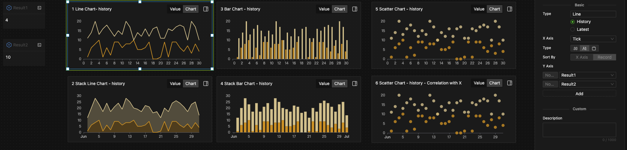
For each Tick, we randomly sample the variables Result1 and Result2 from a uniform distribution, where Result1 = random(0,10) and Result2 = random(10,20). This yields two unrelated time series (as they are independently sampled), each displayed using different charts.
In this context, a line chart would be more appropriate, but this depends on your specific requirements.
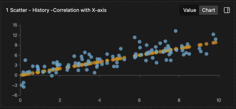
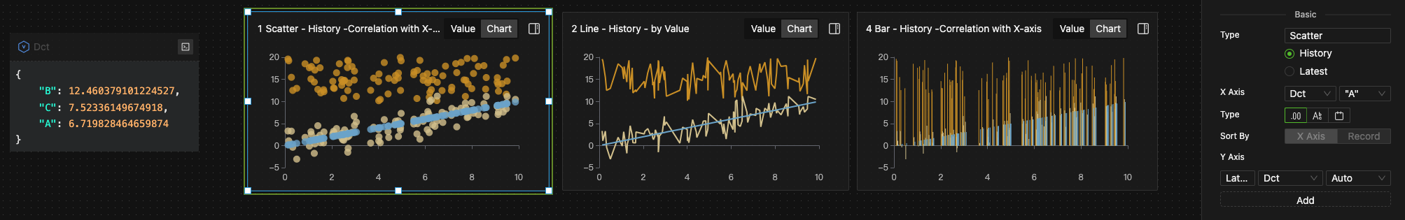
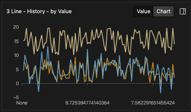
Building on Model Example 1, we introduce a new variable, Result3, which is calculated at each Tick as Result3 = Result1 + normal(0,2). Clearly, Result3 should present significant correlation with Result1.
We set the scatter chart dimension X to Result1 and the metrics Y to Result1 itself (brown), Result2 (yellow), and Result3 (blue).
The following chart types demonstrate the model results when plotting by X-axis value, with Result1 consistently showing a perfect 45° correlation:
- Chart 1: Scatter chart, plotting by X-axis value
- Chart 2: Line chart, plotting by X-axis value
- Chart 3: Line chart, plotting by record
- Chart 4: Bar chart, plotting by X-axis value
In this scenario, a scatter plot is more suitable, but this depends on your specific requirements.
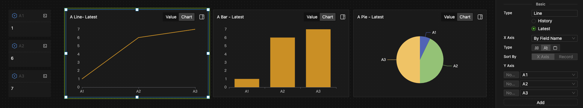
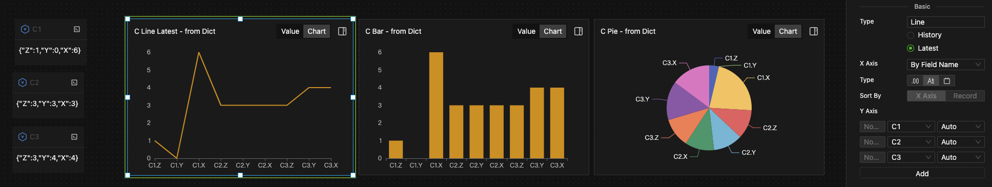
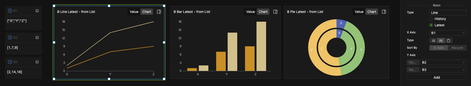
Using the same data as in Model Example 2, but applying the latest data plotting, we obtain the following results:
- Chart A: Select three variables in Number type, using object names as dimensions and object values as measures for plotting.
- Chart B: Select one variable in List type as the dimension, and use two other variables in [Number] format as measures for plotting.
- Chart C: Use the keys of three Dict objects as dimensions, and their values as measures for plotting.
The choice of chart type for presentation depends on your specific requirements.