Statistical Charts
Icon

Function
Statistical charts are designed to plot statistical distribution charts based on data sets in List type.
Key Points
Data Type
Statistical charts can only be created for data objects in the [Number] or {Number} type.
Frequency Histograms
- The system processes specified data in real-time using equal-width binning based on the set number of bins and dynamically displays the results.
- The system also supports calculating and displaying cumulative frequency percentages, averages, and specified upper and lower percentiles.
Support for Entities
When plotting statistical charts for the properties of an entity's individuals, you can quickly switch between the individuals within that entity to view the statistical chart of each individual. This is similar to the entity individuals switcher in the Basic Charts.

Setup Methods
This involves specifying the chart type, selecting data sets, and setting the chart style.
Specifying Chart Type
Currently, only histograms are supported.
Frequency Histograms
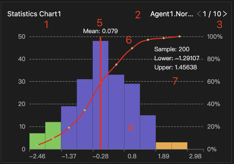
The horizontal axis represents the range of sample bins. The left side of the vertical axis indicates the frequency, while the right side shows the cumulative frequency percentage. The chart's key features are:
- Chart title: You can easily rename this by double-clicking on it.
- Dataset object name
- Entity individual switcher: Note that this option is unavailable when the data object is a property of an entity observer or a global variable.
- Bin columns
- Average value
- Cumulative distribution function curve (CDF)
- Statistical indicators include the total number of data points (sample size), the lower nth percentile, and the upper nth percentile.
Specifying Data Set
Select data objects in the List type from the dropdown menu.
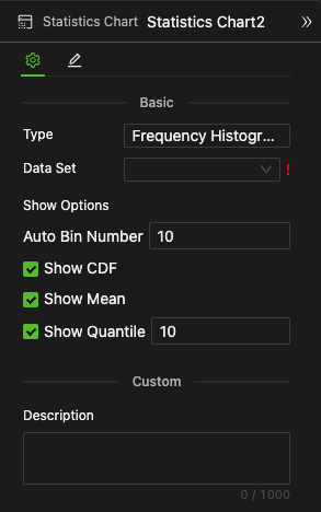
Setting Chart style
-
Auto Bin Number
Enter an integer to specify the number of bins.
-
Show CDF (Cumulative Distribution Function)
Select, as shown in the above diagram, ~45° red curve, or deselect
-
Show Mean
Select, as shown in the above diagram, a red vertical line, or deselect
-
Show Quantile
If selected, specify the percentile in the number input field. The chart will use colors to differentiate the bins corresponding to the upper and lower percentiles, as shown in the green columns on the left and yellow columns on the right in the above diagram.
Example
Consider that an agent population named Agent1, consisting of 10 individuals, has an individual behavior named Generate Sample. The variable in the List type, NormSet, acts as an individual property for Agent1. It stores the Gaussian distribution sample values added by the Compute component at each Tick. You can switch between individuals to view the NormSet data distribution for each, all of which exhibit a normal distribution.